Reveling in Pure Joy, 'Viva Magenta' Is Pantone's 2023 Color of the Year
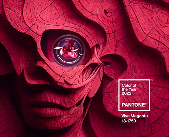
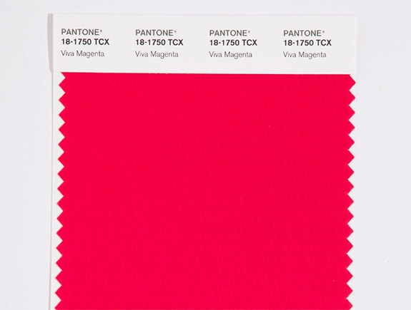
Described as a "new animated red that revels in pure joy," Viva Magenta was just named Pantone's Color of the Year for 2023.
According to The Pantone Color Institute, Viva Magenta is inspired by cochineal, a red dye derived from the dried bodies of female cochineal insects. Cochineal dye was used as early as the second century BC by the Aztecs and Mayans. Incidentally, it takes 70,000 cochineal insects to make one pound of dye.
"In this age of technology, we look to draw inspiration from nature and what is real," said Leatrice Eiseman, Executive Director, Pantone Color Institute. "PANTONE 18-1750 Viva Magenta descends from the red family, and is inspired by the red of cochineal, one of the most precious dyes belonging to the natural dye family as well as one of the strongest and brightest the world has known."
Pantone said its 2023 Color of the Year is powerful and empowering — a new animated red that revels in pure joy, encouraging experimentation and self-expression without restraint. It's an electrifying and boundary-less shade that is manifesting as a stand-out statement.
Consumers who embrace Viva Magenta-inspired fashion items will be accessorizing with fine jewelry featuring ruby, garnet, tourmaline, spinel and red beryl.
Viva Magenta takes the reins from 2022's Very Peri, a dynamic periwinkle blue hue with an intense violet-red undertone. Veri Peri was a brand new Pantone color, and its selection marked the first time the international color authority cooked up a color and then instantly designated it as the Color of the Year.
To arrive at the selection each year, this global team of color experts at the Pantone Color Institute comb the world looking for new color influences. This can include the entertainment industry and films in production, traveling art collections and new artists, fashion, all areas of design, aspirational travel destinations, new lifestyles, play styles or enjoyable escapes as well as socio-economic conditions. Influences may also stem from new technologies, materials, textures and effects that impact color, relevant social media platforms and even upcoming sporting events that capture worldwide attention.
The Pantone Color Institute originally created the Pantone Color of the Year educational program in 1999 to engage the design community and color enthusiasts around the world in a conversation around color.
"We wanted to draw attention to the relationship between culture and color," said Laurie Pressman, Vice President of the Pantone Color Institute. "We wanted to highlight to our audience how what is taking place in our global culture is expressed and reflected through the language of color. This thought process rings just as true today just as it did back in 1999."
Typically, Pantone’s yearly selection influences product development and purchasing decisions in multiple industries, including fashion, home furnishings and industrial design, as well as product packaging and graphic design.
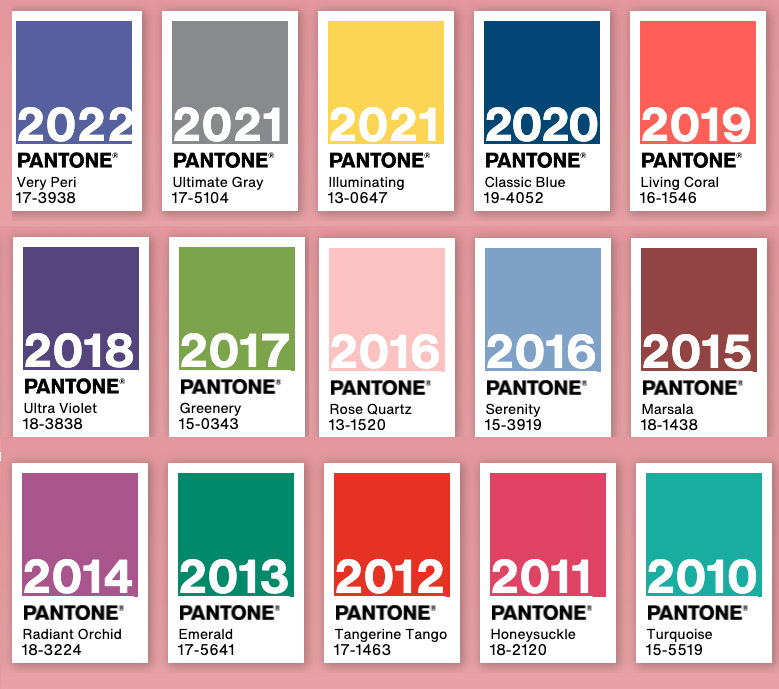
Here are the Pantone Colors of the Year dating back to 2010…
PANTONE 17-3938 Veri Peri (2022)
PANTONE 17-5104 Ultimate Gray (2021)
PANTONE 13-0647 Illuminating (2021)
PANTONE 19-4052 Classic Blue (2020)
PANTONE 16-1546 Living Coral (2019)
PANTONE 18-3838 Ultra Violet (2018)
PANTONE 15-0343 Greenery (2017)
PANTONE 13-1520 Rose Quartz (2016)
PANTONE 15-3919 Serenity (2016)
PANTONE 18-1438 Marsala (2015)
PANTONE 18-3224 Radiant Orchid (2014)
PANTONE 17-5641 Emerald (2013)
PANTONE 17-1463 Tangerine Tango (2012)
PANTONE 18-2120 Honeysuckle (2011)
PANTONE 15-5519 Turquoise (2010)
Credits: Images courtesy of Pantone.


